How to handle histograms over time
When we need to visualize the distribution of individual values, the well-known histogram can be used. If we add a third dimension in the form of time, such a visualization can be complex.
While writing a paper on network traffic analysis I had to deal with the problem of histogram in time. I chose the solution using the so-called heatmap. This is basically a general way of visualization, where we divide the X and Y axes into arbitrary intervals, which creates a defacto 2D array - a good example of a heatmap can be e.g. a confusion matrix.
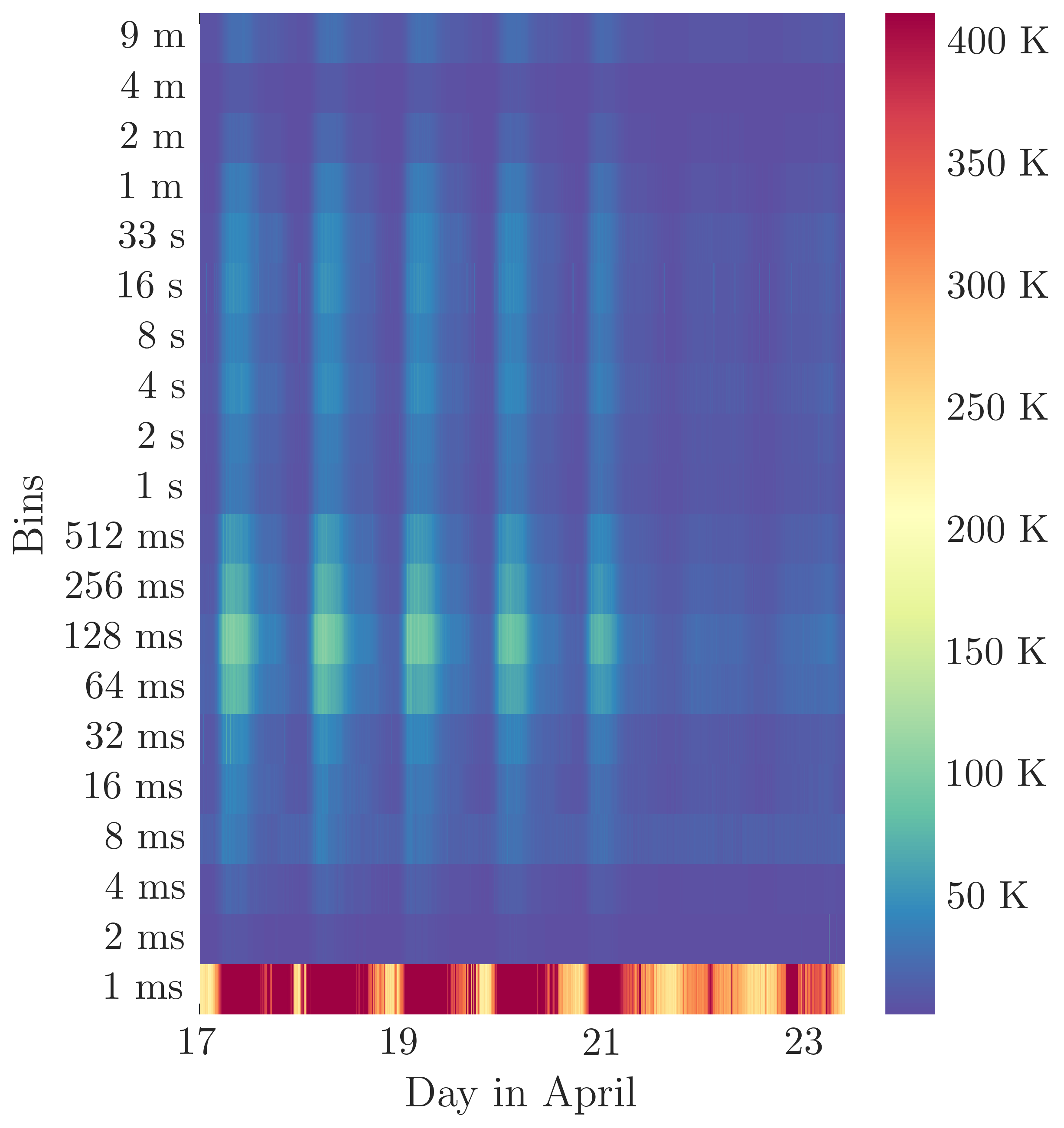
In the X-axis we assume some time, in the Y-axis we will sweep individual bins. The bin value itself will then be visualized by color. I’m making the python code available. Consider it a pseudo-code, there are a lot of things and context missing, but the principle of creation is correct.
Assume we have single histograms in hist_duration column as array. The source of the data.
tmp_ = df[["time", "hist_duration"]]
df_ = pd.DataFrame()
df_["time"] = tmp_["time"]
for i in range(22):
    df_[(2**i)] = tmp_['hist_duration'].apply(lambda x: x[i]) # i know i have 22 bins, 2**i means my bins are log scaled
df_ = pd.melt(df_, id_vars=["time"]).pivot(index="variable", columns="time", values="value")
ax = sns.heatmap(df_[:-2:], robust=True, cmap='Spectral_r')
ax.invert_yaxis()
With customazing the axis, we then obtain something like this:

We see that the magnitude is in lowest bin with light increase around bin 128ms, so we can estimate that distribution as something like Pareto or Pareto-normal. That is much out of scope of this post but it shows how this kind of visualization can be helpful.